Check out the Victory docs here.
It’s been a while since the release of Victory 0.9.0 back in June, so we’re excited to add several new features and bug fixes in order to continue making the creation of D3 charts in React as painless as possible. This post will explore some of the highlights of the new release, including cool new features like VictoryCandlestick, VictoryErrorBar, and the highly anticipated VictoryNative! Note that this version of Victory has breaking changes due to changes in default styles and some default props.
Features
We’ve added two new components to VictoryChart: VictoryErrorBar and VictoryCandlestick. They’re both as composable and flexible as the components that came before them, giving you a wider range of chart types that you can put together using Victory.
VictoryCandlestick
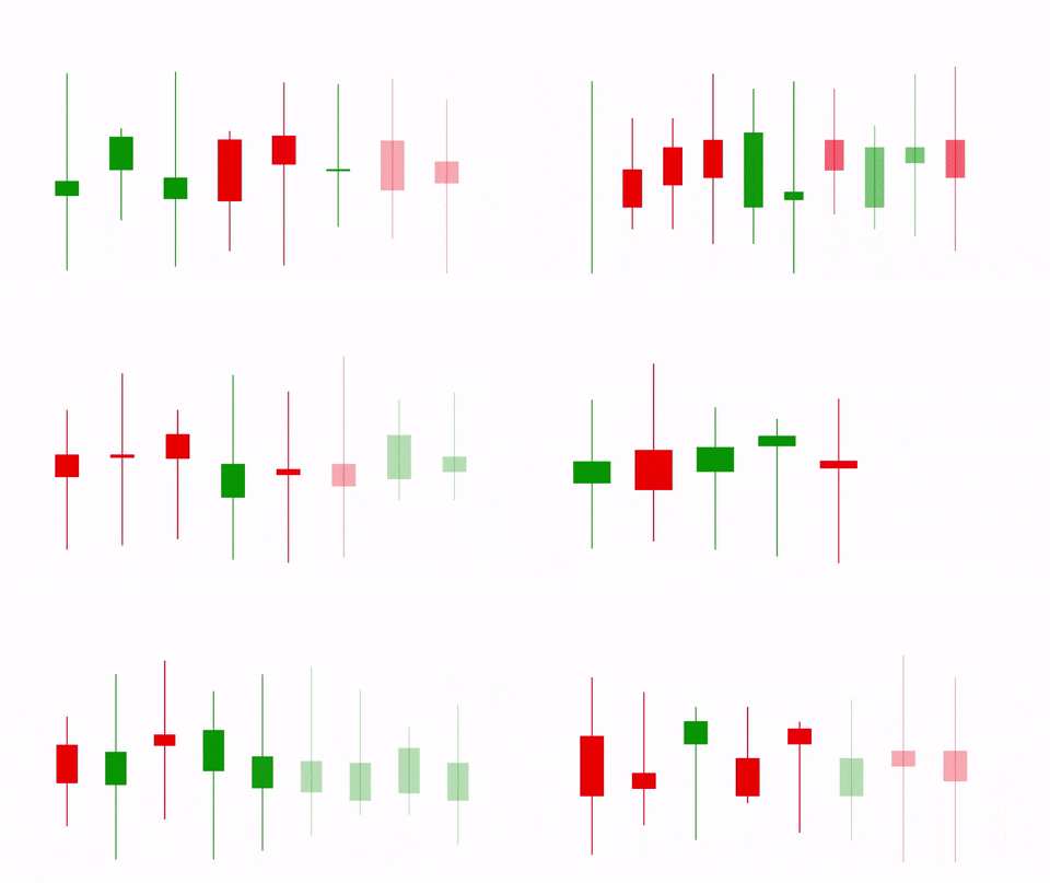
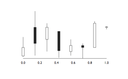
VictoryCandlestick takes data in the format [{x: value, open: value, high: value, low: value}]. Data accessor props for all values are included. Since candlestick charts are most commonly used for commodity and stock price tracking, open and close are the opening and closing price for a given period of time, while high and low are the absolute high point and low point that the cost reached over that same period. Check out this example to see how you can use Candlestick in conjunction with other Victory components!
VictoryErrorBar
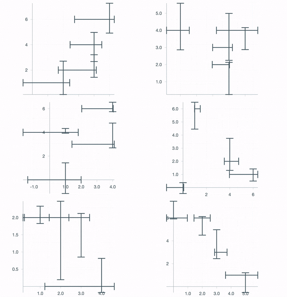
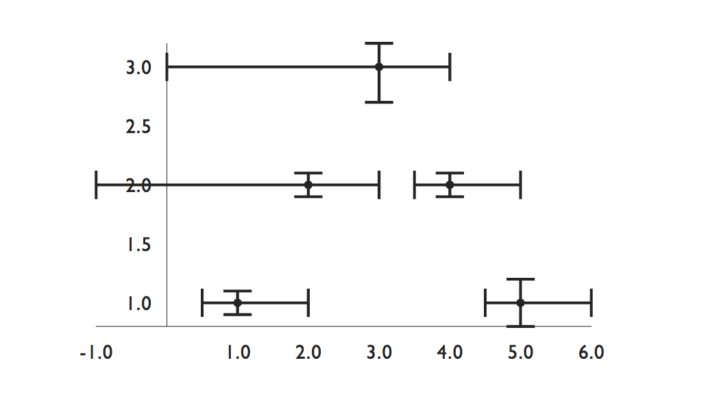
VictoryErrorBar expects data in the form [{x: value, y: value, errorX: err, errorY: err}], where err is a number or two-value array for asymmetric errors. The component includes data accessor props for x, y, errorX, and errorY. VictoryErrorBar can be used on its own or with VictoryChart, and looks great combined with other chart types like VictoryScatter.
VictoryTheme

Another exciting thing that we’ve added is theme support for Victory components! All components can now take a theme prop, which is an object that should be structured approximately like so:
```js export default { area: { data: {}, labels: {}, parent: {} }, axis: { axis: {}, axisLabel: {}, grid: {}, ticks: {}, tickLabels: {} }, bar: { data: {}, labels: {}, parent: {} }, candlestick: { data: {}, labels: {}, parent: {}, props: {} }, errorbar: { data: {}, labels: {}, parent: {} }, line: { data: {}, labels: {}, parent: {} }, pie: { props: {}, style: { data: {}, labels: {}, parent: {} } }, scatter: { data: {}, labels: {} parent: {} }, props: {} }; ```
To see more specifics, check out Material Theme, which is included in VictoryCore. Custom themes are supported as well, as long as they have the same general structure!
domainPadding
Finally, the domainPadding prop has also gotten some upgrades – it’s now available on all components that are compatible with VictoryChart, it supports negative and asymmetric values, and it’s applied automatically to grouped bar charts to prevent charts from overflowing the axis.
For a complete overview of what’s new, check out the Victory Changelog.
Performance Improvements
We made it easier to use Victory with large datasets by making some low-hanging performance improvements, including replacing Object.assign with the lodash assign method, and replacing map and reduce methods with length-cached for loops in methods that are responsible for rendering elements.
Bug Fixes
Key bug fixes include fixing various issues that arose when using log scales, better handling of cross axis positioning when using dates as axis values, and improving how chart components handle being passed empty data arrays or single data points.
And… Announcing VictoryNative!
Create the same Victory SVG charts that you love in React Native. See the repo here.
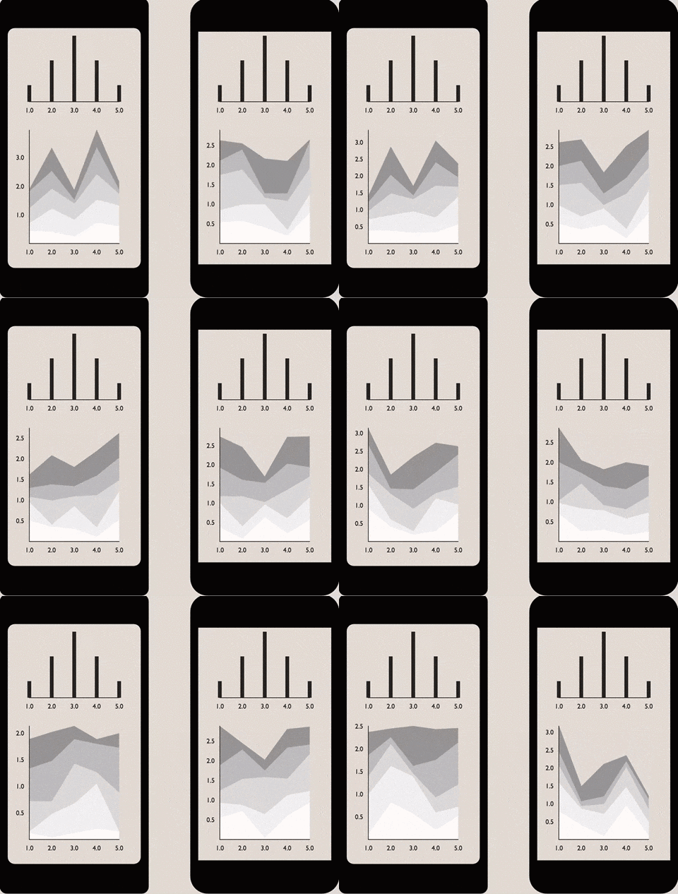
The API for VictoryNative is identical to Victory, so you can do all the same stuff that you love in the browser on iOS or Android. We were excited to see how little code we needed to write in order to adapt the components to be usable in React Native.
If you have any questions or problems you’d like us to address, create an issue in the VictoryNative repo or the Victory repo, or contact us on our Gitter channel.
Thanks for using Victory!
Check out the Victory docs here.

