Futuristic sci-fi UIs in movies often support a story where humans, computers, and interfaces are far more advanced than today, often mixed with things like super powers, warp drives, and holograms. Even the first Star Wars (1977) has UIs that to this day feel more futuristic than what I use on a daily basis. What is it about these UIs that feel so futuristic and appealing? Can we build some of these with the web technologies we have today? For my six-week Fellowship project, I decided to investigate these experiences.
Let's first examine what makes futuristic UIs feel so impressive, then we'll break down how they can be built.
Here are some of my favorite screen examples:
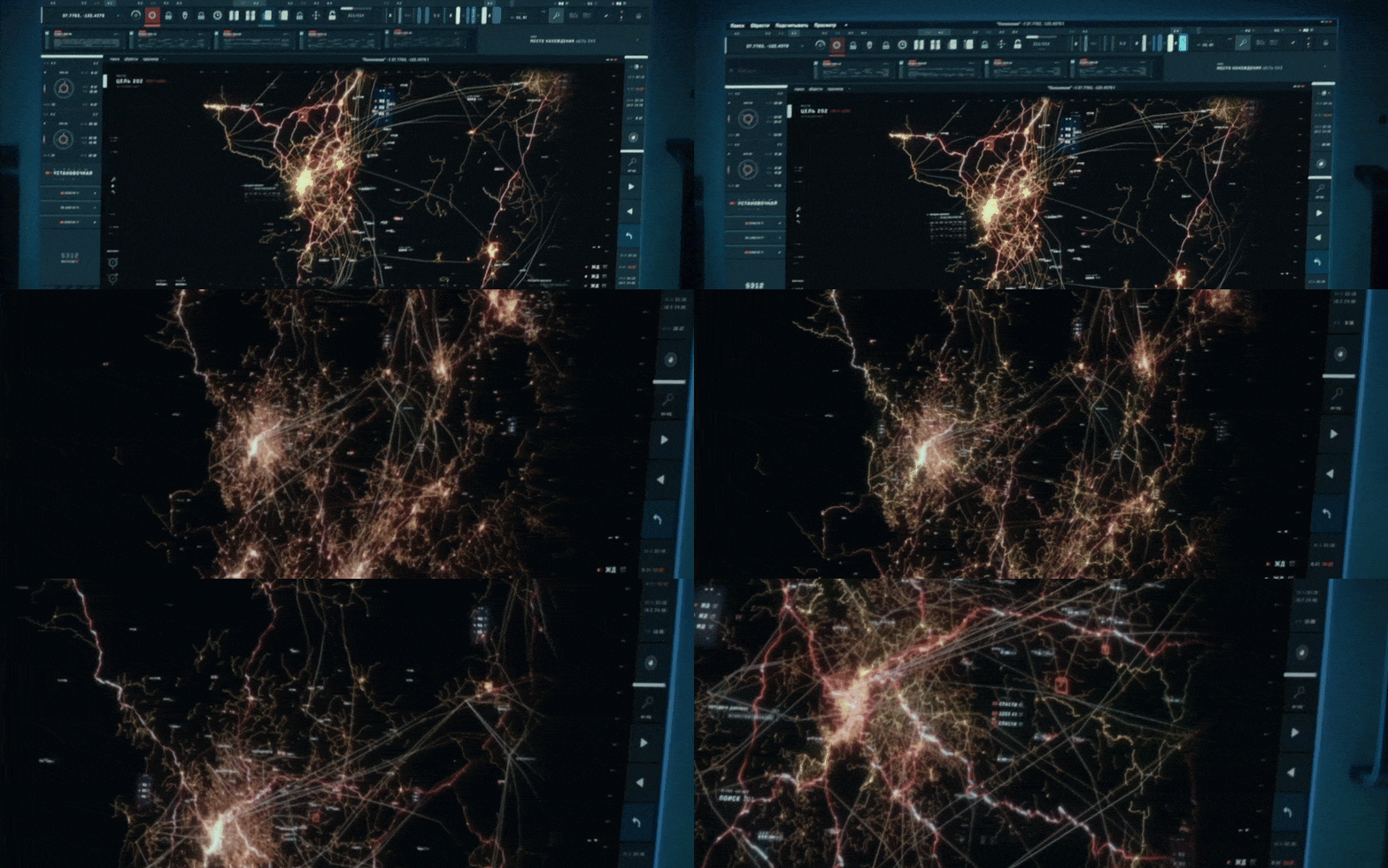
Image from Nicolas Lopardo on Behance

Image from https://www.behance.net/gallery/95188039/PATIENT-Medical-FUI

Image from https://www.behance.net/gallery/100706741/Medical-Interface
There are a few reasons why these GIFs feel so cool:
- Many sci-fi UIs are incredibly intricate works of art. They're covered in tons of data, charts, and impressive focal points like 3D models or maps covered with even more data.
- Many sci-fi UIs are created by motion graphics designers, so all these intricate elements are beautifully animated all at the same time.
- Many sci-fi UIs are presented cinematically with depth of field, glow, light leaks, chromatic aberration, extreme camera angles, and embedded within a powerful story, making them feel significantly more impressive than if they were just on your screen.
Some specific techniques used by the artists creating these UIs are important to recognize, which hints at why we don't often see these styles in our day-to-day life. The last example above is gorgeous, but I think that screen has a layer of frost in it? That reflective ghosting effectively doubles the amount of content on screen making it feel even more intricate. The number of animating elements would be absolutely chaotic for a real user. Many of the elements are meaningless lines, chart axes ticks with no purpose, unlabeled dials and circles, random collections of numbers and text, all artistically placed to look as cool as possible with just one or two clear focal points to support a specific story plot.
Behind-the-scenes looks or artist portfolios are generally the only time you see these types of sci-fi UIs on your screen in full resolution with no special presentation effects. Some hold up well to that level of visibility, but some feel disappointing, revealing "lorem ipsum" placeholder text or all these other details that show they clearly weren't intended to be seen in a realistic context.
💡 If you're interested in learning more about the design of future UIs, check out Sarah Kay Miller's "Designing a functional user interface"
How are these UIs built for movies?
They're all built with tools like After Effects, Illustrator, Maya/Cinema4D/Houdini. The UIs aren't responsive, they aren't accessible, they aren't populated with real data, and they don't have the real-time resource constraints that real UIs have. They're all rendered out into video files that can take minutes to render a single frame.
Can we build these UIs for the web?
We can, to an extent. The main reason we don't is because it's difficult and time-consuming to both design and build something so intricate, that can animate and update in real-time, only to end up with something not practical for a real user. Atop that, the majority of today's popular web tooling and frameworks prioritize developer experience with just enough performance to build our traditional UIs.
But, let's imagine for a minute we have a design that is worth the effort to build. There are four key characteristics that will impact technology decisions:
- Complexity (# of elements)
- Animations (# of concurrently animated & updated elements)
- Effects (post processing, particles, shaders)
- 3rd dimension
Complexity and animation requirements are a spectrum, and some degree of effects and third-dimension can be accomplished by using a hybrid of multiple tools, but how a UI falls among these four characteristics ultimately determines which tools are viable, from SVG to newer Houdini APIs to WebGL to WASM.
Let's take a look at some details from Jayse Hansen's work in Ender's Game. Here's a cinematic still:
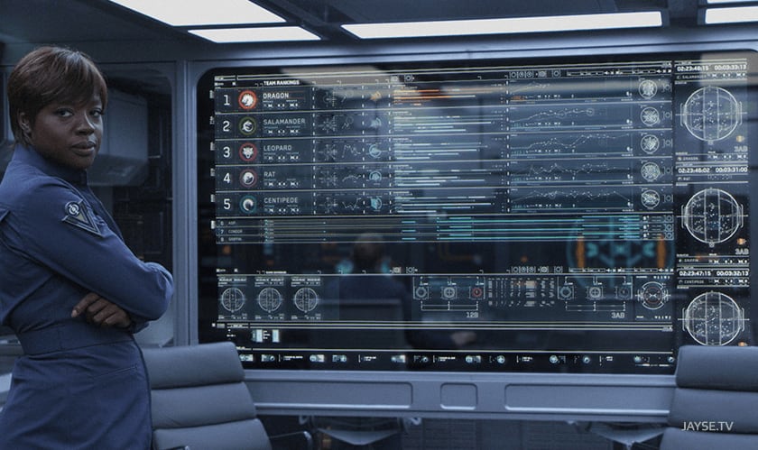
Image from http://jayse.tv/v2/?portfolio=enders-game
And here are raw animations for just 3 (can you spot them?) of the over 50 unique components in that one screen:
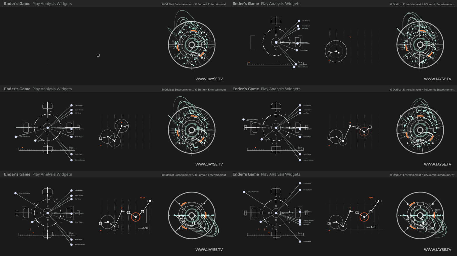
Image from http://jayse.tv/v2/?portfolio=enders-game
At face value, the first two components above could be built with just SVG and CSS animations/transitions. But again, the majority of today's popular libraries prioritize developer experience with just enough performance to build our traditional UIs, which often only have a few of these components on one screen. Therefore, pulling in a popular charting library would quickly chip away at your performance budgets.
💡 You can use Lottie to export animations directly from After Effects into a web-consumable format, but Lottie is currently resource-intensive and for any real use-case you would need something that handles dynamic data.
The third component above has a slight 3D-characteristic but could also be built with just SVG. Notice the really tiny text, though? There are roughly 70 text labels on this one component. Rendering text is actually quite resource-intensive, and with many similar components on the screen, that kind of unreadable text isn't something we could afford to waste processing time on. Some compromises need to be made for the sake of performance, so we would absolutely need to drop those labels or render cheaper placeholder elements until the component is rendered at a legible size.
💡 A lot of us reminisce about the performance and animation capabilities of Flash, but in reality, we were usually looking at very little code, no big abstractions for charts and graphs, static keyframe animations, all on lower resolution screens. Most Flash animations ran under 30 fps. The default setting was 12 fps!
Knowing we can build these individual components with the standard primitives of the web is great, but what about scaling to the volume needed in some of these examples? The JS required to both build and animate all these elements each frame would eventually exceed a ~16ms (60 fps) frame budget. Thankfully, browsers are (gradually) rolling out new APIs that allow us to squeeze out more performance.
Houdini
Houdini is a combination of standards that provide access to lower-level rendering phases of the browser. Historically, we've had a single main JS thread that can alter the DOM and CSS. Houdini allows potentially multiple threads operating on previously unavailable phases of the browser's rendering stack. One of those APIs is Houdini's new Animation Worklet. Animation Worklets allow you to control animations in a separate thread in sync with the GPU compositor, meaning your main thread is only responsible for overall orchestration (starting animations) and not the individual frame updates.
With Animation Worklets, this spring example animates hundreds of springs ~1.8 times faster than without, but arguably more important is that the main thread is freed up for other JS work, as shown here:
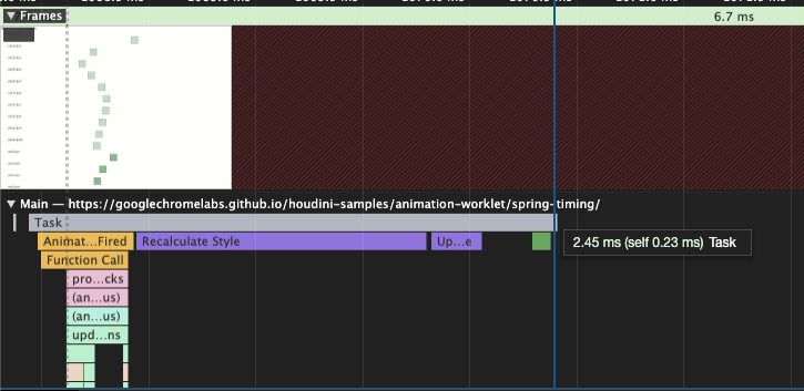
With AnimationWorklet disabled.
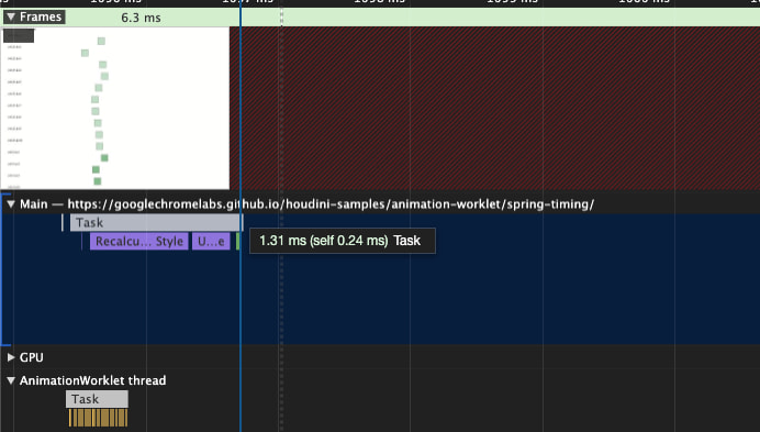
With AnimationWorklet enabled. Notice separate AnimationWorklet thread.
💡As of this posting, AnimationWorklet is still behind a feature flag. https://ishoudinireadyyet.com/
Another Houdini API, the PaintWorklet, also offers potential performance improvements for some use cases. It provides a canvas-like API for painting an element and can also be run outside the main thread. It's important to note, however, this only offloads the JS paint instructions, but the actual rendering/painting itself that occurs on the main thread is often the actual bottleneck. E.g., 100 ctx.stroke() calls on a single canvas are queued by the browser and may take only a fraction of a millisecond of JS time, but the actual rendering done by the internals of the browser will take longer.
With these two new APIs you can parallelize more JS work than previously possible, but we're still ultimately bound by the underlying rendering mechanisms of the browser. There's only one way to get around that, which is working with the GPU itself via WebGL. This is also a requirement for rendering 3D objects and special effects with shaders.
WebGL
WebGL has been available for a while, but historically it's been an extremely steep learning curve for an average web developer. Three.js has made working with WebGL easier, but it's not at all intended to be a UI framework itself. New tools like react-three-fiber (R3F) have started to bridge these gaps, though. R3F lets you build three.js scenes using the react component/hooks model, including the ability to use shaders, post processing, instanced geometry, and every other trick available in three.js. Combined with react-three-a11y, you can even build accessible experiences!
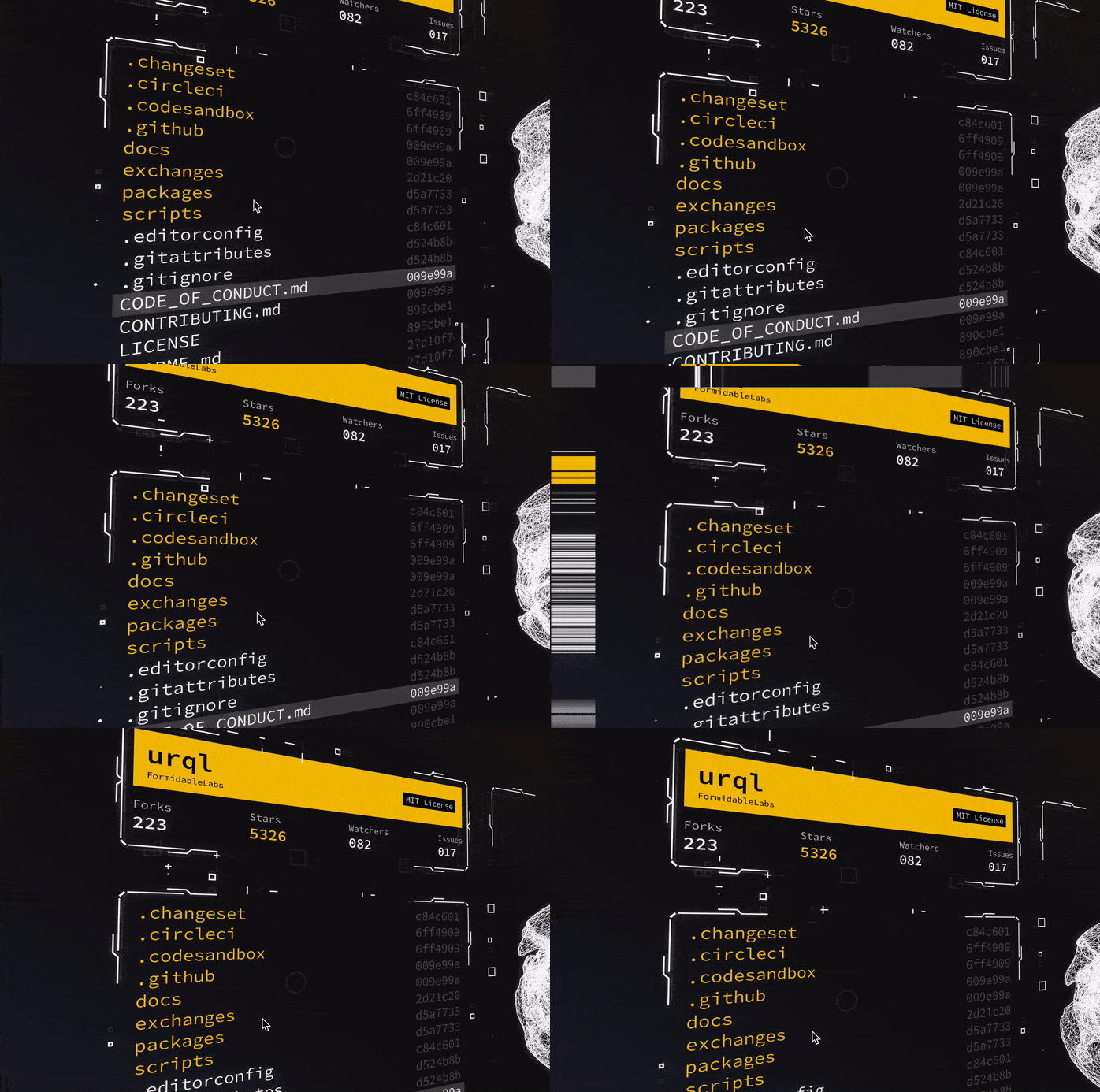
UI built with react-three-fiber
This proof-of-concept interface was built with react-three-fiber, react-three-flex for layout, troika-three-text for text rendering, react-spring for animations, and react-postprocessing for bloom/glitch/noise effects. For the panels, SVG paths designed in Figma are converted into 3D meshes using three.js's SVGLoader and procedurally placed and animated. Given that it's WebGL, we can also render arbitrary 3D models.
These newer libraries allow more traditional web developers to be incredibly productive in 3D. Since react-three-fiber is just regular ol' react, we can even pull in libraries like Victory and render charts by overriding a few Victory primitives:
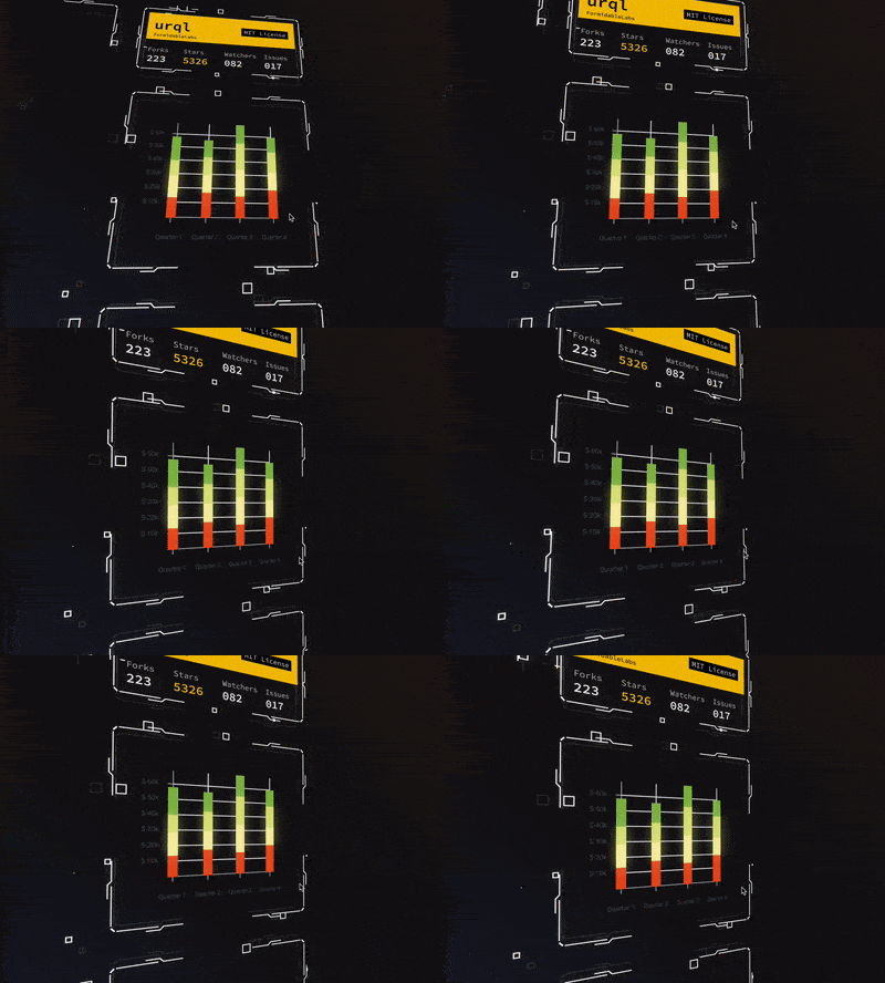
Stacked bar chart from Victory rendering in a 3D space
The code for a simple bar chart looks like:
<FlexBox alignItems="center" justifyContent="center">
	<VictoryBar
	  data={data2012}
	  x="quarter"
	  y="earnings"
	  containerComponent={<Container3D />}
	  dataComponent={<Bar3D />}
	  groupComponent={<Group3D />}
	  labelComponent={<Label3D />}
	/>
</FlexBox>
The 3D models, camera movements, and post-processing effects in the GIFs above aren't realistically possible with just traditional DOM elements.
But again, naively layering all these multi-purpose, developer-friendly abstractions aren't going to meet certain performance needs. Here's another example from Ender's Game:
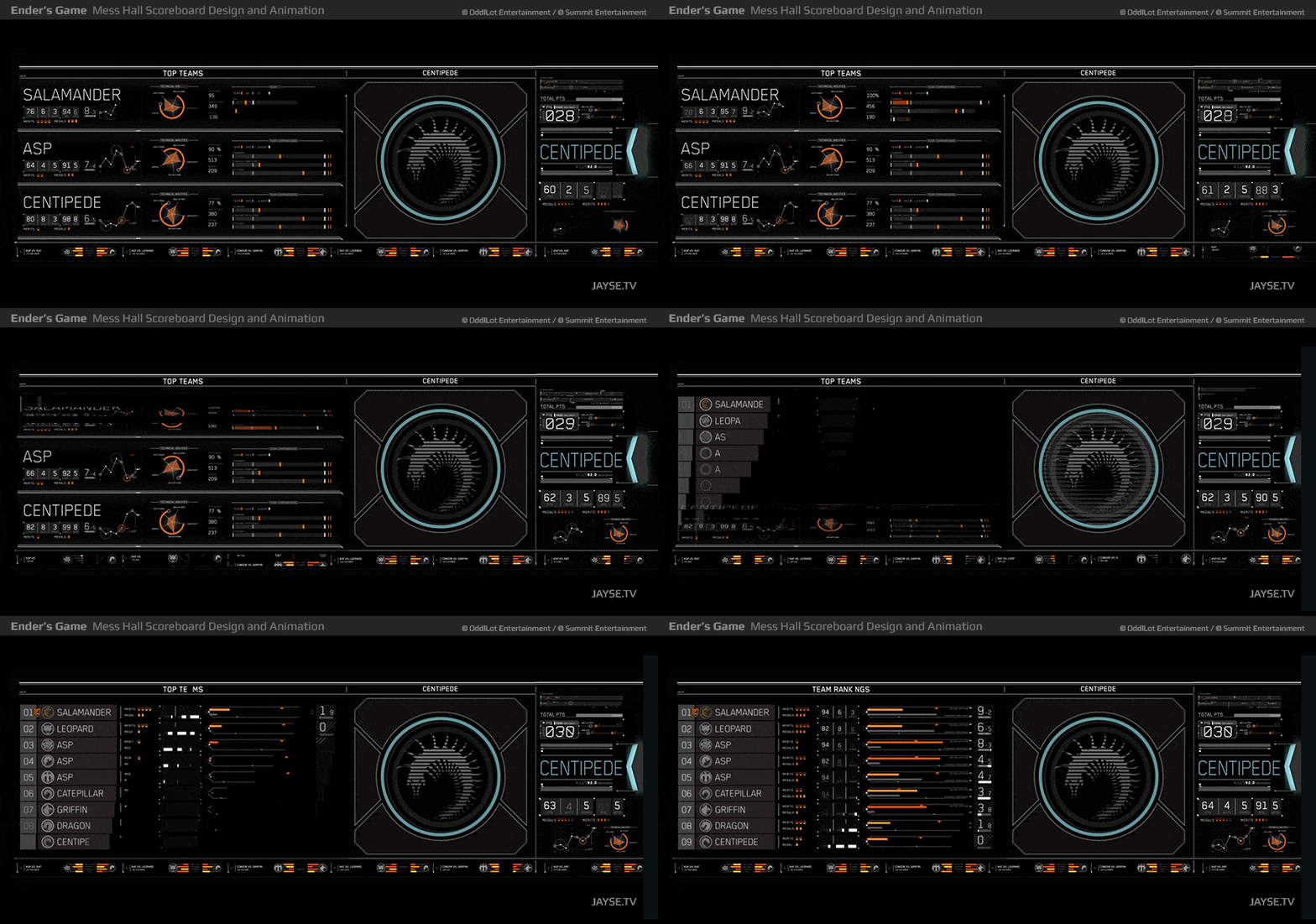
Using flex box for layouts increases developer productivity, but simultaneously animating the widths and heights of all these components shown above, within a fully flexible layout, would be a performance disaster. Each of these components and layouts would instead need to be built with these specific animation requirements in mind. As with most technologies, naive uses can easily result in a worse, slower UI rendering mechanism than what the DOM provides.
As of today, react-three-fiber and three.js run exclusively on the main JS thread. As the number of unique objects in your scene grow, the more CPU usage is required to instruct the GPU what to render in each frame. For most UIs, that single CPU thread will likely become the bottleneck. That leads us to our final strategy.
Even lower: WebGPU + WebAssembly
WebGPU and WebAssembly (WASM) are the next steps in the quest for performance. WebGPU combined with WASM gives you as close to the metal performance possible in a browser. WebGPU is a modern API for interacting with the GPU, providing better performance and swappable backends (e.g., Vulkan, DX12, Metal, OpenGL) depending on the device. WASM lets you run extremely optimized code written in languages other than JS, like Rust.
💡 WebGPU is under heavy development and only available behind flags in canary builds: https://github.com/gpuweb/gpuweb/wiki/Implementation-Status
Using these raw technologies to build any kind of meaningful UI from scratch would take forever, but given the cross-platform, mostly browser-agnostic nature of this toolchain, and the browser finally providing near-metal CPU/GPU access, I anticipate that we'll start seeing serious investment in alternative, novel, multi-platform rendering mechanisms that will make building these kinds of UIs easier, not just on the web but across all kinds of devices.


