What is Nuka Carousel
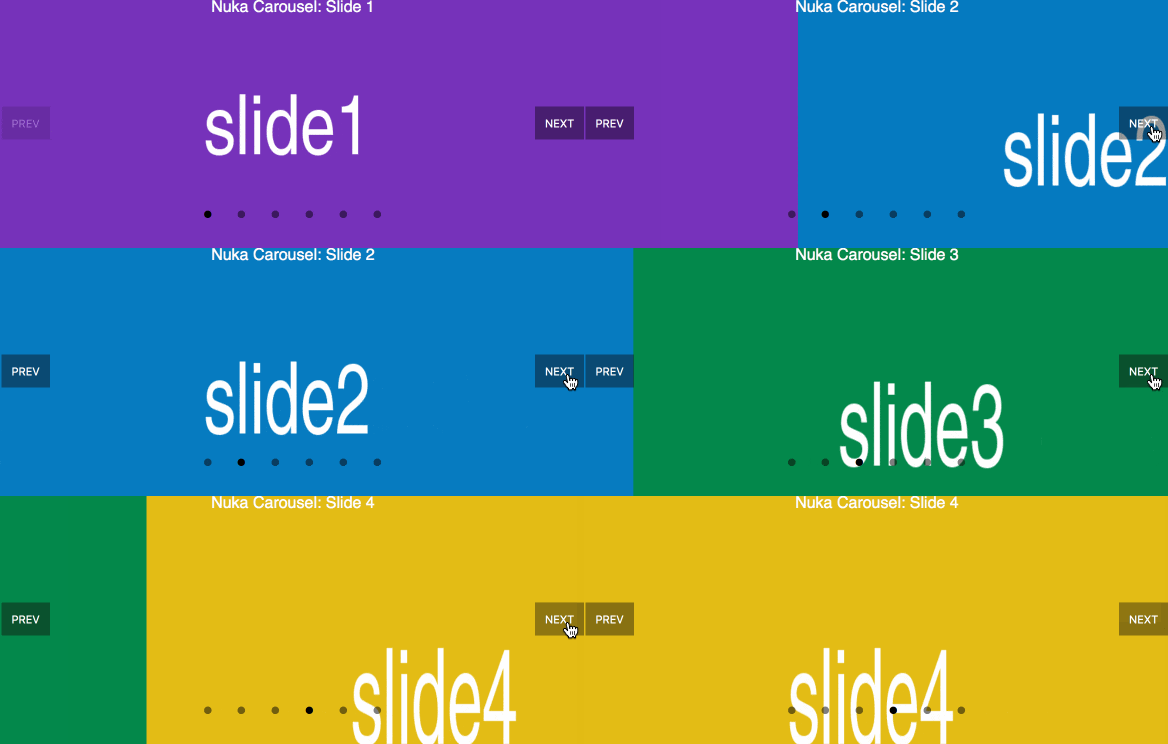
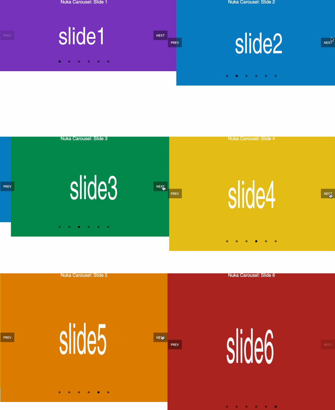
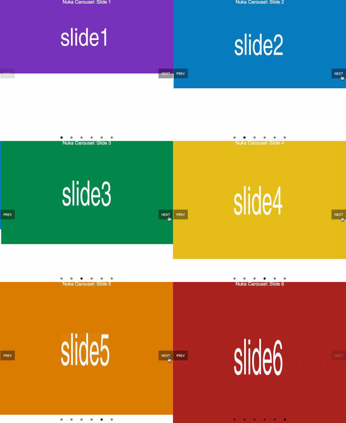
Nuka Carousel is a pure-React carousel component that can support any kind of component as children, including text and images. Nuka Carousel has no built-in design, so it can be styled to fit any app. The carousel navigation can be controlled with either a container component or your app’s state management, making it easy to incorporate into your build.

All-new API for custom controls
Custom components can be added to eight zones along the edge of the carousel. By default, Nuka Carousel displays a previous and next button along with page indicators. The carousel component now has render props for all eight zones (top left, center left, bottom left, etc.) that pass control functions and state to your custom components. For example:
<Carousel
  renderCenterLeftControls={({ previousSlide }) => (
    <button onClick={previousSlide}>Previous</button>
  )}
>
Adaptive Height
Nuka Carousel now supports dynamic height, based on content. There are three optional modes set by a prop: first mode sets the height of the carousel based on the initial slide; max mode enumerates through all the slides and sets the height to the tallest slide; and current mode is dynamic and resizes the carousel based on the content of the current slide.


Modern tooling and React patterns
Nuka Carousel is now built using Webpack 4, Babel 7, and React 16. Mixins and createReactClass have given way to React.Component and modern React patterns. In addition to CommonJS, Nuka Carousel now has ES module outputs for apps with supporting tooling (e.g., supporting tree shaking for slimmer builds in modern Webpack).
Getting Started
It's easy to integrate Nuka Carousel into any React app- just yarn add nuka-carousel. To learn more about Nuka Carousel’s API or contributing to Nuka Carousel, visit the GitHub page.


